
The evolution of book cover design
Everyone knows the age-old saying “Don’t judge a book by it’s cover”, but we have to be realistic and admit that everyone does that. A great book cover design should make you think. It should communicate about the story that is between the covers, to spark an interest about the topic.
The style in which a book cover is designed is influenced by the continually changing design trends. In a previous blog post we’ve explored how various retro design trends have inspired modern magazine designers. This article is somewhat different. It’s not about various design trends, but it compares the past and present covers of 10 classic novels.
Obviously the first edition published in 1950’s does not look the same as the one from the 1990’s. The society is in a continuous change, so there will always will be a need for something new and fresh.
It’s interesting to notice how the design of the original book covers evolved, and what new elements showed up on the contemporary editions. So let’s analyse them together!
1984 – George Orwell
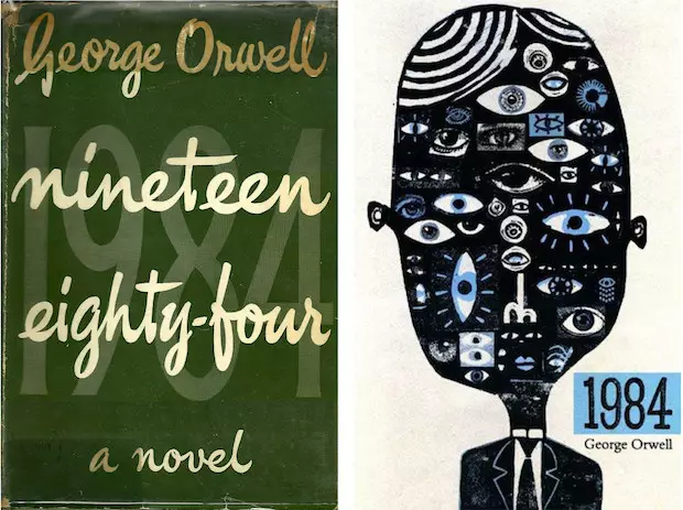
1984 is one of the most popular novels, and the first book cover edition was published by Secker and Warburg in 1950. The design has a vintage touch because of the hand letter font, but it doesn’t give us any clue about the story.
The contemporary edition designed by Ben Jones brings something else to the table: a strange illustration with many eyes which shows very well how the utopian society from George Orwell’s novel looks like. It makes you want to read more, to discover the mystery behind the metaphor. This amazing book cover won the Polish Book cover Contest in 2011. Good job, Ben!
Pride and Prejudice – Jane Austen
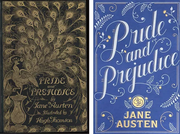
Pride and Prejudice by Jane Austen is a classic novel beloved by many readers. This elegant vintage version was published in 1894. It is known by collectors as “The Peacock Edition” and it became iconic for this novel. Inside the book you’ll find illustrations by Hugh Thomson.
The second book cover is designed by Jessica Hische in 2011, who came up with a classy composition that brings back the feelings and style of the victorian age. It has some similarities with the original one, but you can also notice the modern lettering which is quite a popular design trend.
Alice in Wonderland – Lewis Carroll
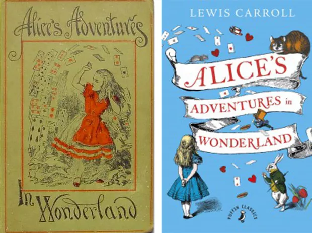
On the left you can see the 1898 book cover of Alice in Wonderland. It has the specific illustrations and lettering of the period: we can recognize Alice and some objects from the story, like poker cards.
The Penguin Classics edition from 2015 is also illustration-based and it has a similar vintage look as the old one, but it’s more colorful, more alive and we can notice more characters from Wonderland.
Lolita – Vladimir Nabokov
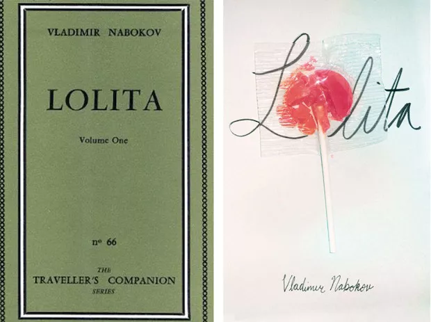
The first edition of Lolita from 1955, had a simple green cover, because it wasn’t easy to find a good image to illustrate what the author wanted to be seen on the cover of his controversial novel: “If we cannot find that kind of artistic and virile painting, let us settle for an immaculate white jacket (rough texture paper instead of the usual glossy kind), with LOLITA in bold black lettering.” (Nabokov)
60 years later you can find many inspired redesigned versions of “Lolita”. I like this version because of how the designer played with the hand lettered typography and the lollipop, creating a strong visual effect. It kinda gives a hint about what you’ll find in the book.
The trial – Franz Kafka
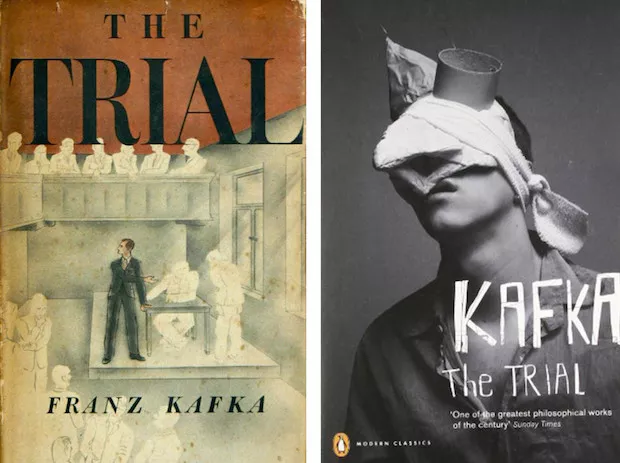
This is the first American edition of The Trial designed by George Salter in 1937. The illustration is very telling about what happens in the novel – how the hero struggles with the invisible law.
The Penguin Classics edition from 2000 is based on the same idea but the approach is more abstract and more compelling. You can also notice that the font used on this one is more unconventional than the original one.
The Great Gatsby – F. Scott Fitzgerald
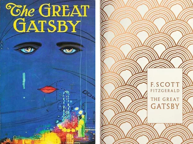
The Great Gatsby book cover designed by the spanish artist Francis Cugat in 1925, is one of the most popular book covers in the history of American literature. The mysterious sad eyes and the city lights combined with the font creates a piece of art. Maybe one of the reason why the book cover had so much impact is because of the collaboration between the author and the designer.
The redesigned book cover has nothing to do with the melancholic eyes. The designer chose an elegant pattern which represents the opulence of 1920’s and the prevailing art deco style of that period.
The Odyssey – Homer
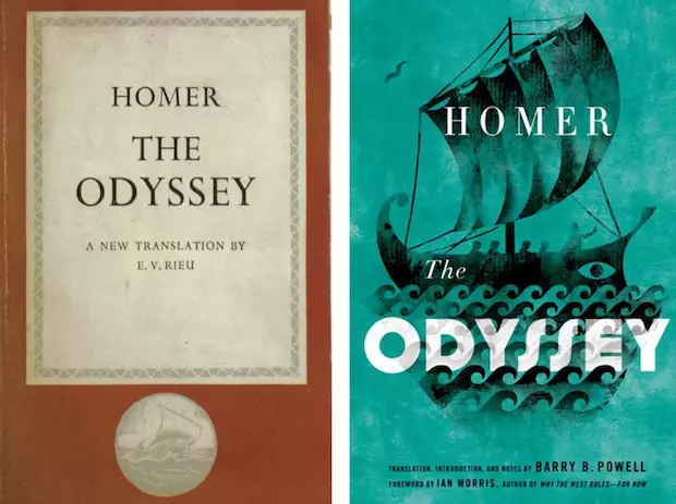
The Odyssey is an ancient Greek epic poem and it’s supposed to be written on or around the 8th century BC. In that period the books were written on papyrus. This is 1950’s edition, with a classic design and a small illustration that represents Ulysses’s returning home journey after the fall of Troy.
The contemporary one from 2014 illustrates a ship that sails on the sea. The style of the boat and the waves reminds us of the beautiful paintings from the famous greek vases.
Moby Dick – Herman Melville
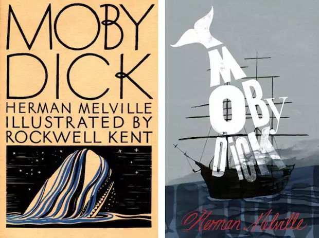
I love how the first edition looked. Especially the big font used for the title and the white whale depicting the obsession of the captain for the white whale, Moby Dick.
The modern edition is very different, showing an illustration mixed with typography. This way the designer creates a focal point with the type-whale that’s trying to sink the boat. As you can see, the cover itself gives us hints about the story, creating interest in readers.
The old man and the sea Hemingway
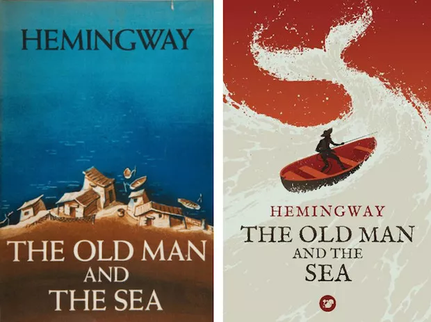
The first edition of Hemingway’s famous novel was published in 1952 by Charles Scribner’s Son, and it represents a little fishing village. Hemingway won the Pulitzer Prize in 1953 for his story about the cuban fisherman and his struggles on the sea.
Levente Szabo came up with a different design, turning the book cover in a really cool visual story showing the battle of the fisherman with a giant marlin. I like how he turned the wave into a fish tale.
One flew over the cuckoo’s nest – Ken Kesey

One flew over the the cuckoo’s nest was first published in 1962, by Viking Press & Signet Books. The plot is focusing on the rebellious Randle Patrick McMurphy who faked insanity to accomplish his sentence in the hospital rather than in prison. The book cover from the left (1962) creates an almost psychedelic feeling because of the chosen type and colors.
The second one, designed by AJ Hateley, won the Penguin Design Award in 2012. It’s an interesting design that illustrates, in a symbolic way, the free spirit of the hero, who had the power to stand up for the others.


Interestingly I just watch this relevant video this morning The Making of John Mayer’s ‘Born & Raised’ Artwork