How to make retro style inspired magazines
Are you interested in creating a new and original magazine? It’s a great idea to look at vintage books and publications that represent different styles from the history of graphic design. Let yourself be fascinated by retro design and be inspired to create something different and unique.
Over the years, art has influenced the thinking of generations. It’s important to know the context and how these trends appeared before you adapt them to your designs. The content of the publications should match the style.
So let’s discover together the evolution of retro design over 100 years and see what principles we can use in our publications.
Victorian (1850—1900)
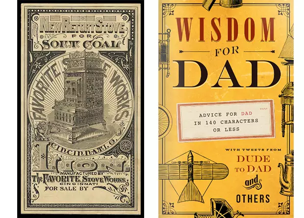
The Victorian era is named by the Queen Victoria who ruled in England in the 19th century. The Victorian retro style was influenced by the industrial revolution and the printing press becoming more readily available. The industrialization caused many changes and radical shifts in how things were made.
“Victorian style” publications have extreme variation of type size, a lot of details and ornaments, and the letters have shadows and outlines.
The modern book cover on the right has nice retro elements inspired by the victorian era.
Arts and Crafts (1870s—1910s)
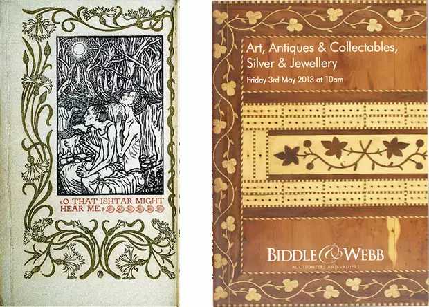
The Arts and Crafts movement was a reaction against the manufacturing of the industrial design. The originators of the movement created layouts with excessive pattern designs.
They were inspired by nature and old compositions from the past, and they designed something very organic. The artists used a lot of vegetal forms and curves, and their typefaces were influenced by the medieval times.
The ornamental and vegetal motifs can be seen on the contemporary cover of the art & antiques brochure on the right, which combines the past with the present.
Art Nouveau (1880s—1910s)
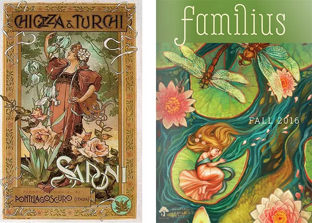
Art nouveau is a french expression that means “new art”, and it’s characterized by organic lines, plants motifs and stylized forms. The artists were inspired by the japanese tradition, and this is revealed in the way they used abstract lines and shapes.
This catalogue cover has an Art Nouveau feeling because of the organic lines from the illustration.
Dada (1910s—1920s)
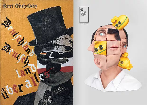
Dada was a revolutionary cultural movement. The avangardists broke the rules of the traditional art aesthetics and replaced them with something new. The new form of art was totally random. Marcel Duchamp, a promoter of the movement, has coined the concept “ready made”, which is taking a mundane object and turning it into art.
The artists expressed themselves through collages, combining different materials and textures.
The magazines and publications from that period have spontaneous lettering and images, and they weren’t afraid to experiment new techniques.
The weird collage of the digital magazine on the right reminds me of the dada’s philosophy of transforming basic objects in art. This modern approach is a very good example of turning an old idea into something new. The way this cover was designed shows the spontaneity and experimentation of the dada movement. The designer wasn’t afraid to play with and different shapes.
Art Deco (1920s—1930s)
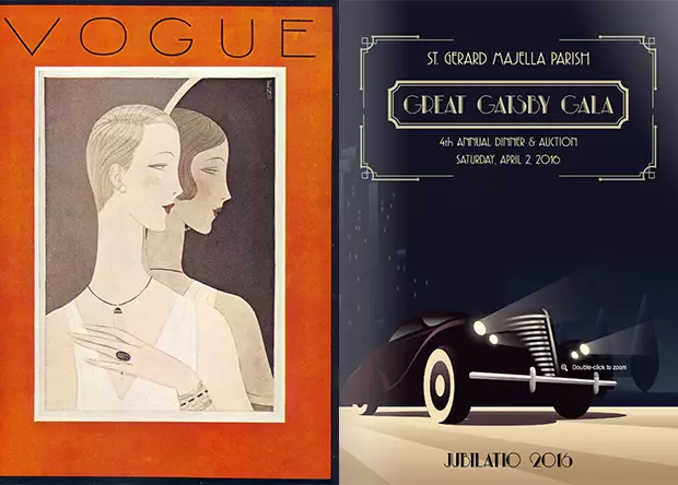
Art Deco is a retro style that first appeared in France, and then in America. It revealed a new aesthetic that was consistent with the new, modern way of living.
The retro design publications from that era had strong geometric lines, abstract shapes and two-dimensional forms.
When I think about Art Deco, the first thing that crosses my mind is the Great Gatsby style. Both covers have the geometric and shapes specific to this style.
International Style (1950s—1960s)
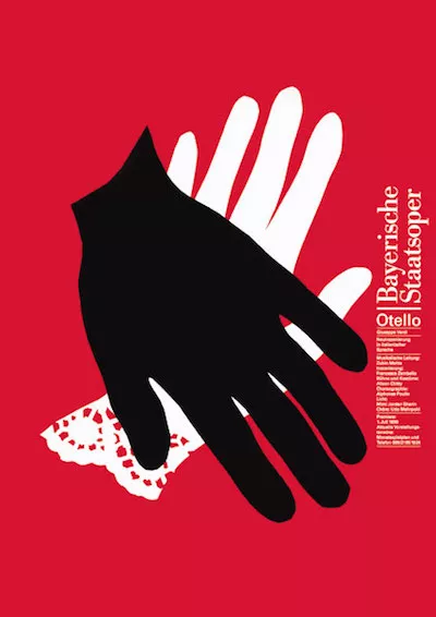
International style brings minimalism and precision after WWII, improving the modernist ideals of interwar designs.
Sans-serif typography, incorporated photography or illustrations, and plenty of whitespace, are all characteristics of this minimal style. Another thing that is specific for this design style, is the use of grid and structure.
I love the minimalist look of this brochure. The way the designer combined images and sans serif typography highlights very well the minimalistic design principles.
Psychedelic (1960s—1970s)
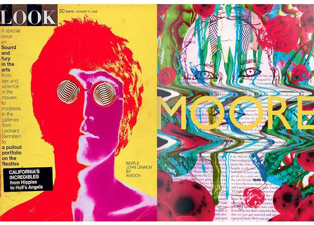
The psychedelic movement was influenced by the prevalence of hallucinatory drugs. Most of the followers of the trend were young people, who were protesting for peace, love and freedom.
Magazine covers, posters, flyers all had the same style with bright and intense colors, swirling lines; the entire page was covered with elements.
The colors of this cover and the image brings back memories of the hippie times.
Postmodernism (1970s—1980s)
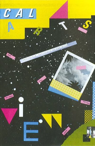
Postmodern designers ignored the traditional style and created something random, without meaning. They followed the principles of color, photomontage and a playful composition.
This digital magazine has a postmodernist look inspired by the style of the 80’s, which is quite popular nowadays.
Grunge (1990s)
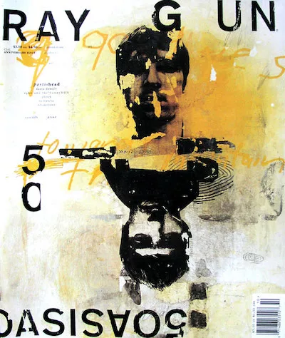
The grunge style has developed in opposition to the 80’s colorful style. This trend was born in 1992 along with the Ray Gun magazine, which was a music publication. David Carson was the creative director of the publication and he was one of the trend-setters.
What makes the grunge style different from the previous movements? The grunge magazines had dirty strains, blurred images, broken icons, textures and expressive typography.
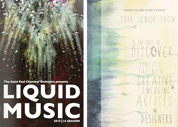
The cover of the digital brochure on the left has a blurry and grungy background image that shows very well the style’s influence.
The watercolor texture and the handwritten font of the publication on the right prove that the designer found inspiration in the grunge period.